Yelp Usability Redesign
UX Research & Design
Role: UX Researcher & Designer | Context: UBC Human Computer Interaction Course Project
Participants: 10+ Yelp/restaurant review app users
Overview
This project evaluated how users discover and compare restaurants on Yelp. Through usability testing and interviews, I identified key pain points around filter overload, trust in sponsored results, and comparison difficulty, then translated those insights into product requirements and a mid-fidelity prototype designed in Figma.
Problem Statement
Users struggle to efficiently find trustworthy, relevant restaurants on Yelp. An overwhelming number of filters slows decision-making, while sponsored results appearing prominently in search undermine users' confidence in the platform.
Methodology
I conducted think-aloud usability sessions followed by semi-structured interviews to understand user expectations and frustrations when using Yelp. Findings were synthesized using affinity diagrams to identify recurring patterns.
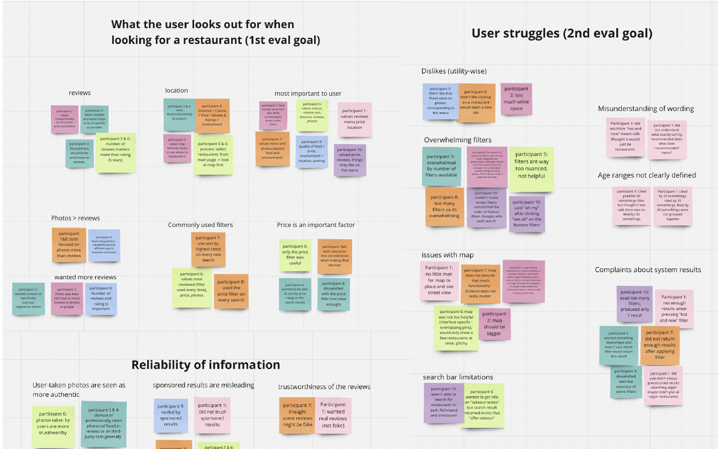
Key Findings
- Users anchor decisions on price, reviews, and location
- Sponsored listings reduce perceived trust and authenticity
- Excessive filtering options increase cognitive load, not control
Product Requirements
Based on research findings, the redesign needed to:
- Support fast restaurant discovery based on user priorities
- Communicate reliability and transparency, especially around sponsored content
- Reduce cognitive load while preserving flexibility for exploration
- Support users’ search process by allowing them to identify restaurants based on their priorities (e.g., price, reviews, location, menu information, ratings).
- The user should feel that restaurant information is reliable and authentic.
- Provide a sufficient number of filter options while avoiding overwhelming users with too many choices.
- Maintain a sense of trustworthiness even with the presence of sponsored results.
- Provide enough search results so users do not feel disappointed by limited options.
- Offer a personalized set of categorized filter options tailored to users’ needs, based on their preferences or past behavior.
The Solution
I designed a medium-fidelity, horizontal prototype in Figma to explore breadth of interaction rather than depth. The design experimented with two conceptual models:
- Night market model for visual browsing and discovery
- Map-based model for spatial awareness and comparison
Key features included toggleable grid/map views and a lightweight comparison flow to help users evaluate restaurants more confidently.
Evalution & Reflections
Follow-up usability testing showed the design was effective in supporting restaurant comparison and overall satisfaction, but revealed learnability and intuitiveness issues, particularly within the map interactions.
Future iterations would focus on:
- Simplifying comparison interactions
- Improving visual hierarchy in grid layouts
- Leveraging familiar map patterns (e.g. persistent sidebars) to reduce friction